

Digital experience
Build Multi-Audience Websites That Speak Clearly to Every User

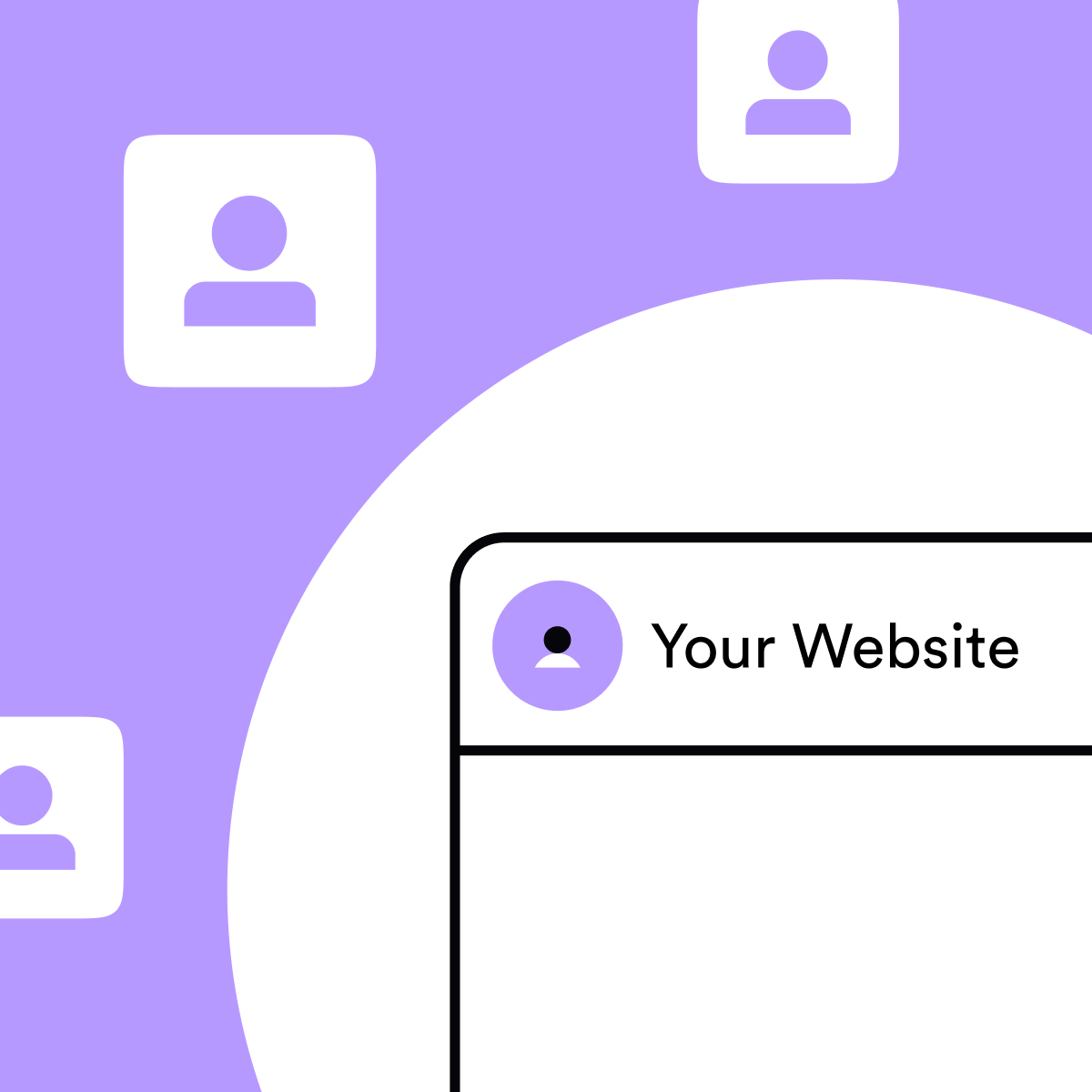
Most websites aren’t built for a single audience. They’re built for several, often with very different needs, levels of knowledge and expectations, from boards and buyers to experts and non-experts, commercial teams and institutional stakeholders. All of them arrive at the same place, hoping to find what they need quickly, whether they’re visiting for the first time or returning with a specific goal in mind. And yet, many websites are still designed as if everyone wants the same thing. They don’t
The challenge most organisations face
When a website has to serve multiple audiences, things often start with good intentions and end with compromise.
Homepages try to say everything.
Navigation grows to accommodate every internal request.
Design gets softened to avoid alienating anyone.
Important journeys get buried under explanation and caveats.
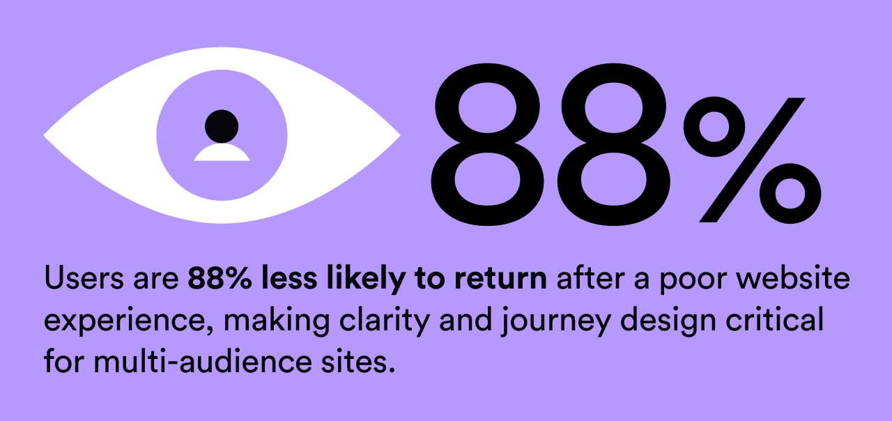
The result is rarely wrong, but it’s often unfocused. And unfocused websites are hard to trust, hard to use, and easy to ignore.
The problem usually isn’t effort or ambition. It’s a lack of clarity about who the website is helping at any given moment.
One website doesn’t mean one experience
At Everything Connected, we don’t start by asking how many pages a site needs. We start by asking:
- Who is this for?
- What do they need to do?
- What do they need to feel confident doing it?
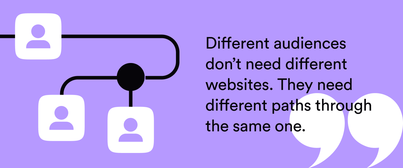
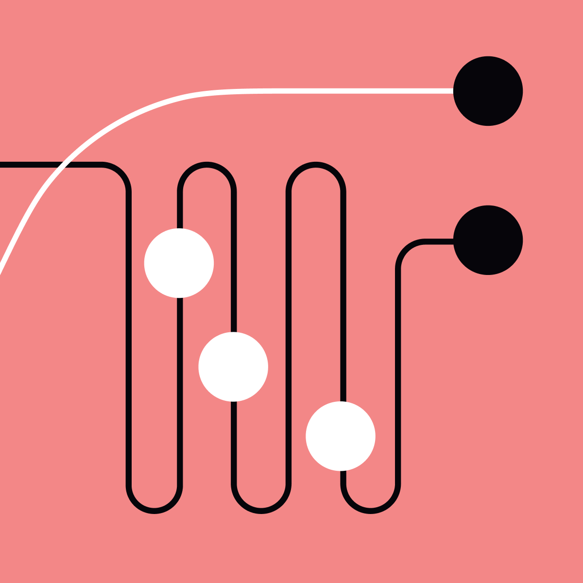
Different audiences don’t need different websites. They need different paths through the same one. That distinction matters.
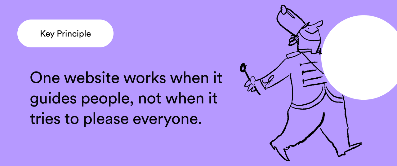
A well-designed multi-audience website doesn’t try to please everyone at once. It guides people clearly, based on what they’re there for.
How we approach multi-audience design
Over time, we’ve learned that the most effective way to serve diverse audiences is through restraint, structure and intention.
We design journeys, not pages
Pages are static. People aren’t.
We focus on how different users arrive, move through the site, and exit, and design around those journeys rather than individual screens.
We let structure do the heavy lifting
Clear information architecture, hierarchy and signposting reduce the need for explanation. When structure is right, complexity becomes manageable instead of overwhelming.
We prioritise clarity over cleverness
In complex or high-trust environments, confidence comes from being easy to understand, not visually loud. Design should support comprehension, not compete with it.
We design for trust before persuasion
Especially for unfamiliar or sceptical audiences, credibility matters more than conversion tactics. Clear language, calm design and reliable performance all play a role.
We optimise over time, not just at launch
Our Digital Experience Optimisation approach means we don’t treat launch as the finish line.
We learn from real behaviour and continuously refine how different audiences use the site.
Complexity handled well feels simple
Some of the most effective websites we’ve worked on serve highly technical, institutional or specialist audiences, alongside much broader ones. The goal isn’t to flatten that complexity. It’s to organise it. When people feel guided rather than overwhelmed, they stay longer, trust faster, and get where they need to go with less friction.
The quiet confidence of a well-designed site
The best multi-audience websites don’t shout. They don’t try to impress everyone simultaneously.
They’re confident enough to:
- reveal information gradually
- prioritise what matters
- and respect users’ time and intelligence
That kind of confidence doesn’t come from adding more, It comes from knowing what to leave out. Designing for multiple audiences isn’t a one-off exercise. It’s an ongoing process of learning, refining and optimising how people actually use your site.
If your website has to work for very different audiences, and most do, this is where our Digital Experience Optimisation approach comes in. Talk to us about optimising journeys that actually guide people forward.


.png)